Term 2
Thayer Street Map
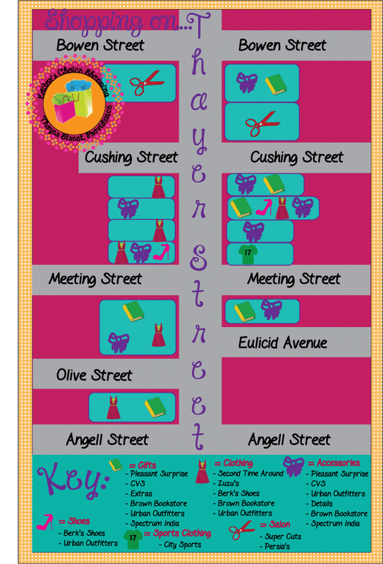
My concept for my map was cute, fun, and girly. I came up with this concept because when I think about shopping, I think about all the cute things I'l buy, and how much fun it is. I used several tools in Adobe Illustrator to create the map. The symbol tool was used to make the symbols that show what kind of store each is. I used the symbol sprayer tool to make the symbols and use them around the map. I used the type-on-a-path tool to make the seal, as well as the key. I used the stoke tool to make parts of my map show up better, and also to outline parts in a different color. There were two challenges that I came across while making my map. The first was coming up with a theme. I didn't have any idea what I wanted to use as my concept. The other challenge I encountered was making the rough draft. I'm not a very good artist, so the drawing part was hard. Also, I didn't know where to start, and what to do first. I didn't know what I wanted my map to look like. I think the most successful parts of my map are the color scheme, as well as the symbols. I believe the colors all work together nicely, and fit the concept perfectly. I believe the symbols I created fit the shops they are respresenting, and theme very well. I also like how the polka dotted border keeps your eye on the map, not wandering off the page. If I could change anything about my map, I would change the symbol for "Gifts". I would make it fit the theme better, by making it a diary, and changing the color of it. I might've also added a fun-looking pen across the image. Another thing I would've changed is the seal. I would make the polka dots around it a different color, purple and blue probably, so it would fit the theme, and stand out more.
Waffle Day - Syrup Label

My Advanced Graphics class had a Waffle Day recently. We did this to show the relationship between doing a project
and making real-life things. In order to prepare for this special day, we created a syrup label. Mine is shown above. The
manufacturing process is as follows:
Input: Waffle Iron, 2 Cups of Pancake Mix, 1 1/3 Cups of Milk, 1 Egg, 2 Tbsp Vegetable Oil, Butter, Syrup, Recipe, Utensils
Process:
1. Preheat waffle iron
2. Mix together ingredients
3. Stir until there are no more lumps and the batter is completely smooth
4. Grease the waffle iron
5. Pour the mixture onto the hot, greased waffle iron
6. When waffles are done cooking take out carefully
7. Spread with butter, and cover with syrup
8. Enjoy!
Output: Perfect, golden brown waffle with melted butter, soaked in syrup.
Feedback: While making the waffles, we used two different types of waffle irons. There was a lot of feedback that one of
the irons made better waffles than other. They were a better size, and came out better.
Polar Express Ticket
For this project, Mrs. Nassiff came in again with a task from a kindergarten teacher at her daughter's school. They were doing a Polar Express Day and wanted us to make tickets for her students. Since there was a limited amount of time, Mrs. Schmigle split us up into two groups; one to design the front, the other for the back. The tickets had to be easy to read and have gold in it, but each side had different requirements. I designed the front of the ticket. The front of the ticket was required to say Polar Express, Admit One, North Pole, and have a ticket number. We were also required to use downloaded fonts and brushes, and have an image. I used two fonts for this project, a fancier one, and another that looks authentic to the North Pole and Polar Express. I chose the colors dark blue and gold because that is the color of the Polar Express, and red because it fits the Christmas theme and looks good with gold and dark blue. I used the feathered-edge tool to make the image oval-shaped. I used many different burshes and opacities to create the snowflakes all around the ticket. Although my ticket was not chosen by the teacher, I think I did a very good job with it.
Lichtenstein Self Portrait

For this project, I first learned about the artist that is famous for his Ben-Day Dot paintings, Roy Lichtenstein. I looked at some of his paintings and then what Ben-Day Dots were. They are many dots that together make up one color. For example, the color of my shirt is actually made up of a dark red base with lighter red dots. First I had to take a photo of myself, upload it to the computer, and resize the image in Photoshop. I then used Illustrator to complete the rest. I outlined my face, hair, and features using the pen tool. Then, I filled in what was not going to be filled in with the Ben-Day Dots. This includes everything except for my shirt, skin, and hair color. Next, I began the process to make the dots, using several different tools, such as the elipse tool. Once the pattern was made, I added it to the swatches panel and filled in my skin, shirt, and hair with the appropriate colors. I made at least 6 patterns using different colors to see which colors looked best together, and which patterns looked best in the picture. After that, I redid most of the outlines on my face with a different brush stroke to make it look like it came from a comicbook. I then continued the project by making the talk bubble. It was made by combining several circles with the circle and pathfinder tools. Finally, I downloaded a font and came up with the quote.
10 Careers from the Presentation
- Graphic Designer
- Photographer
- Web Designer
- Interior Designer
- Advertiser
- Game Designer
- Entertainment Designer
- Audio Production
- Industrial Designer
- Motion Graphic Designer
Illustrator Exercise


