Term 3
Prom PSA
This is a stop motion PSA that a classmate, Jess, and I made. It will be the opener of a longer video that will be shown to the entire school at the prom assembly.
Don't Be a Bully, Be a Friend
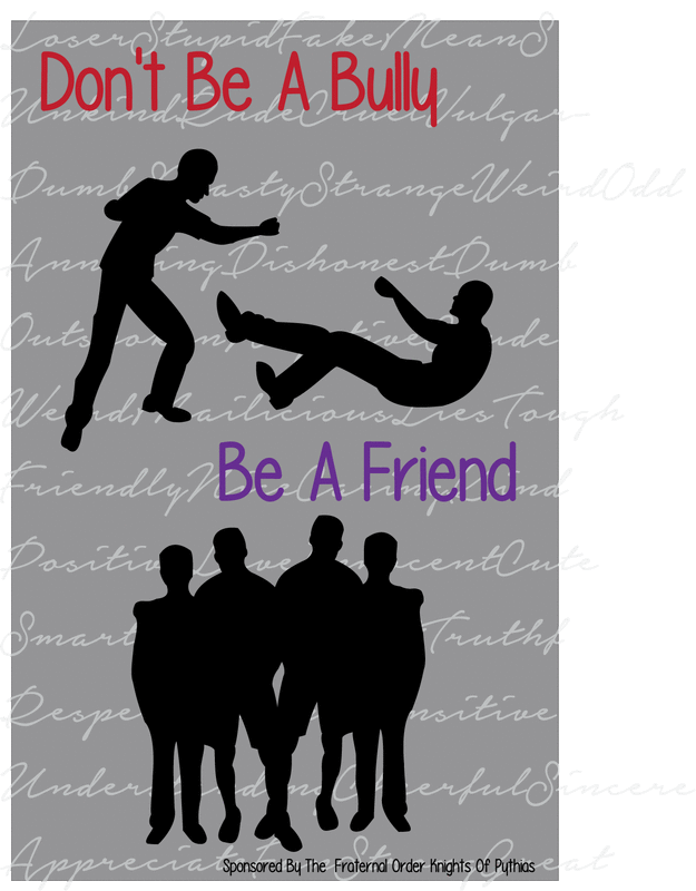
Mr. Adams told us about this project. It is from The Fraternal Order Knights of Pythias. The contest was to create a poster, of a certain size depicting the message "Don't Be a Bully, Be a Friend." The poster had some regulations and guidelines. The message must've been understood at a glance. We are encouraged to use color, but the simpler the better. Posters would be judged on the message, originality, effective display of the message in the specified dimensions, neatness, and adherence to stated rules and regulations. I decided to have a two-piece poster. The top being bullying, and the bottom being friendship. The background is something that I am very proud of. I love how its subtle if you are looking at the poster as a whole, but if you look closer, you can see the significance of it. If you noticed, the scripted words go from harsh and mean words towards the top, where the picture of bullying is, to kind and caring at the bottom with the picture of friends. I chose to do everything in black and white except the words because I wanted the words to stick out. Red was chosen for "Don't Be a Bully" because I see red as a hard and violent color. I chose purple for "Be a Friend" because I see purple as a loving and soft color.
Dodgeball TShirt
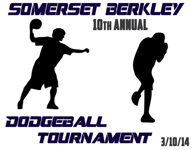
The 10th annual dodgeball tournament was this past week, and my graphics class was asked to create a shirt for it. I like my shirt because it is sporty, but not too much.
Prom PSA (continued)
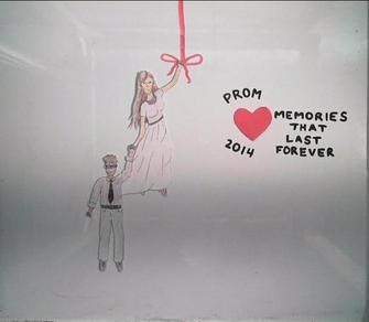
This is a teaser of the Prom PSA that two other students and I are working on. I will post the whole thing later, as not to spoil it.
Quotes Projects


These are quick, fun projects that I wanted to do. The first one is a lyric. I love this lyric from a Keith Urban song. I wanted to make it my screensaver for my phone, so I decided to download my own font and put it on a galaxy background picture. I had to duplicate the picture three times to make it the correct size. However, when I did that, you could easily see the ugly lines that showed where the image was copied. I used the clone tool to statically copy certain spots to make the lines disappear. The second one is a picture I found on Pintrest. I loved the picture, but wanted to add meaning to it, so I looked up fire quotes and found this one. These were just fun projects that I will use personally as wallpapers for my phone.
The third picture is again, a picture that I found on Pinterest, as was the quote. I just happen to like the two together. I didn't edit the picture at all, but chose a simpler, elegant font. I didn't capitalize anything in order to match the youthfulness of the picture.
The third picture is again, a picture that I found on Pinterest, as was the quote. I just happen to like the two together. I didn't edit the picture at all, but chose a simpler, elegant font. I didn't capitalize anything in order to match the youthfulness of the picture.
